
GloSwitch — UI/UX Design for a Cross-Border Payments App
The Challenge
UX/UI design for GloSwitch's cross-border payments and currency exchange app — designing trust, clarity, and simplicity into every screen of a product where users are moving real money.
The Challenge
Designing for fintech means designing for anxiety. Every screen in a money-transfer app carries an implicit question from the user: "is this safe, and did it work?" For GloSwitch, the design challenge was to make a genuinely complex process — currency conversion, identity verification, cross-border settlement — feel effortless and trustworthy, especially for users who may be transferring money for the first time through a digital-only platform.
Design Process
Research & Framing Before any screens, the starting point was understanding who relies on cross-border transfers and why: diaspora communities sending money home, freelancers being paid internationally, small businesses handling cross-border payroll. Each of these users shares one thing — low tolerance for ambiguity when money is involved.
Information Architecture The flows were structured to minimize the number of decisions a user has to make mid-transaction. Currency conversion, recipient details, and fee breakdown are surfaced together rather than sequentially hidden, so users always see the full cost and outcome before confirming.
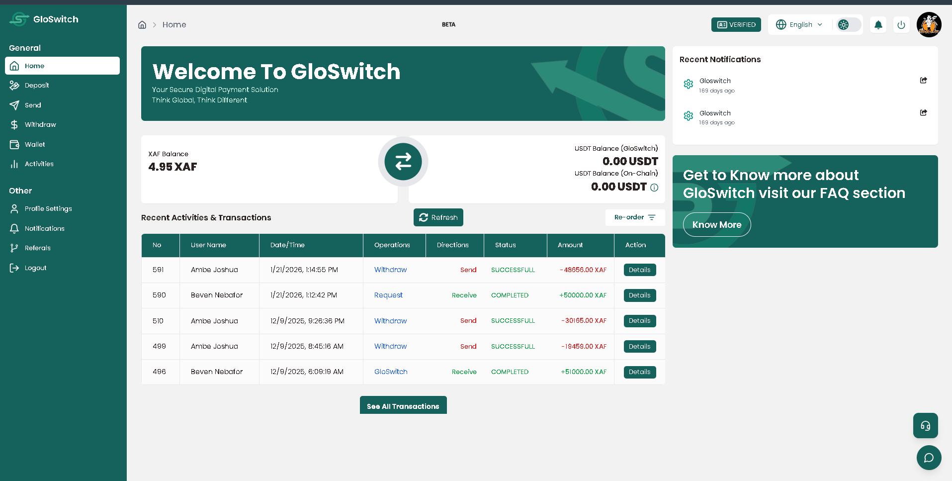
Visual Design System The visual language avoids typical "flashy fintech" tropes in favor of restraint — a controlled color palette, clear typographic hierarchy, and consistent use of confirmation and status states (pending, processing, complete) so users always know where their money is in the pipeline.
Trust & Clarity Patterns Specific UX patterns were designed around trust-building: transparent real-time exchange rate display, explicit fee breakdowns before confirmation, verification-status indicators, and transaction tracking screens that reduce the "did it actually go through?" anxiety common in money-transfer apps.
Designing for Real-World Conditions Screens were designed with low-bandwidth and intermittent connectivity in mind — lightweight layouts, clear loading and offline states, and interfaces that degrade gracefully rather than breaking on slower connections, reflecting the real network conditions across the platform's target markets.
Outcome
A cohesive, trust-oriented design system that shaped GloSwitch's live, launched product — helping a technically complex cross-border payments process feel simple, transparent, and safe to a first-time user.
Tech Stack
Execution
- uiux
- fintech
- product design
- mobile app